Style Guide
A comprehensive overview of the design system, including typography, colors, components, and patterns used throughout the site.
Typography
Font Families
Primary Font
Inter
Used for all text, headings, body, UI elements, and navigation
Type Scale
Display
72px / 4.5rem - Hero headlines
Heading 1
48px / 3rem - Page titles
Heading 2
30px / 1.875rem - Section headers
Heading 3
20px / 1.25rem - Subsection headers
Body Text
16px / 1rem - Default body text
Small Text
14px / 0.875rem - Captions and labels
Micro Text
12px / 0.75rem - Fine print and metadata
Color Palette
Primary Colors
Background
Off-white with subtle warmth
Foreground
Deep charcoal, almost black
Accent
Muted emerald
Semantic Colors
Card
Pure white
Muted
Very light gray
Secondary
Light gray
Destructive
Muted red
Spacing System
Consistent spacing creates visual rhythm and hierarchy. Our spacing scale is based on 4px (0.25rem) increments.
Extra Small
4px / 0.25rem
Small
8px / 0.5rem
Base
16px / 1rem
Medium
24px / 1.5rem
Large
32px / 2rem
Extra Large
48px / 3rem
2X Large
64px / 4rem
3X Large
80px / 5rem
Buttons
Primary Buttons
Secondary Buttons
Slide-In Effect Button
Interactive button with sliding background and text transition on hover
Text Buttons
Icon Buttons
Form Elements
Cards & Containers
Basic Card
A simple card with border and padding. Used for containing related content and creating visual separation.
Interactive Card
A card with hover effects. Adds subtle shadow on hover to indicate interactivity.
Muted Card
Uses muted background color for subtle emphasis without strong borders.
Accent Card
Highlighted card using accent color for important callouts or featured content.
Border Radius
Small
2px / 0.125rem
Medium
4px / 0.25rem
Large
6px / 0.375rem
Extra Large
8px / 0.5rem
Animations & Transitions
Transition Durations
Fast (150ms)
Quick interactions
Normal (300ms)
Standard transitions
Slow (500ms)
Dramatic effects
Common Animations
Scale on Hover
Slide on Hover
Shadow on Hover
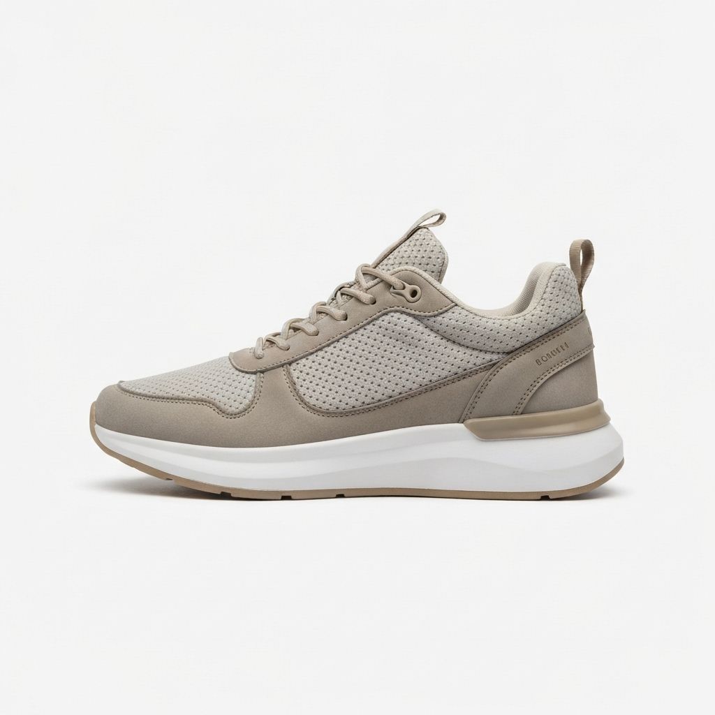
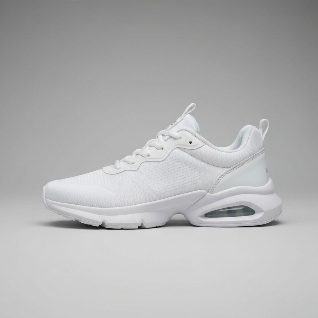
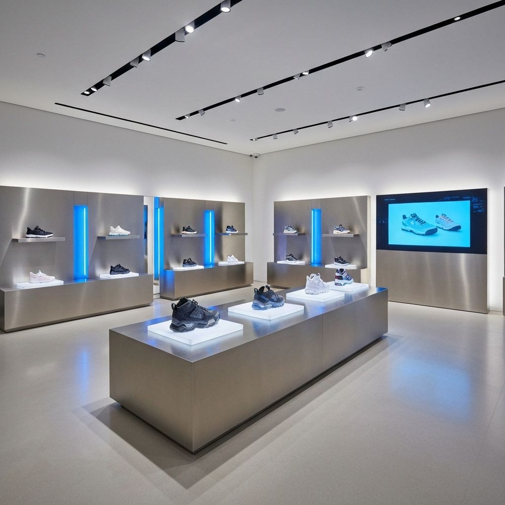
Product Cards
Standard Product Card
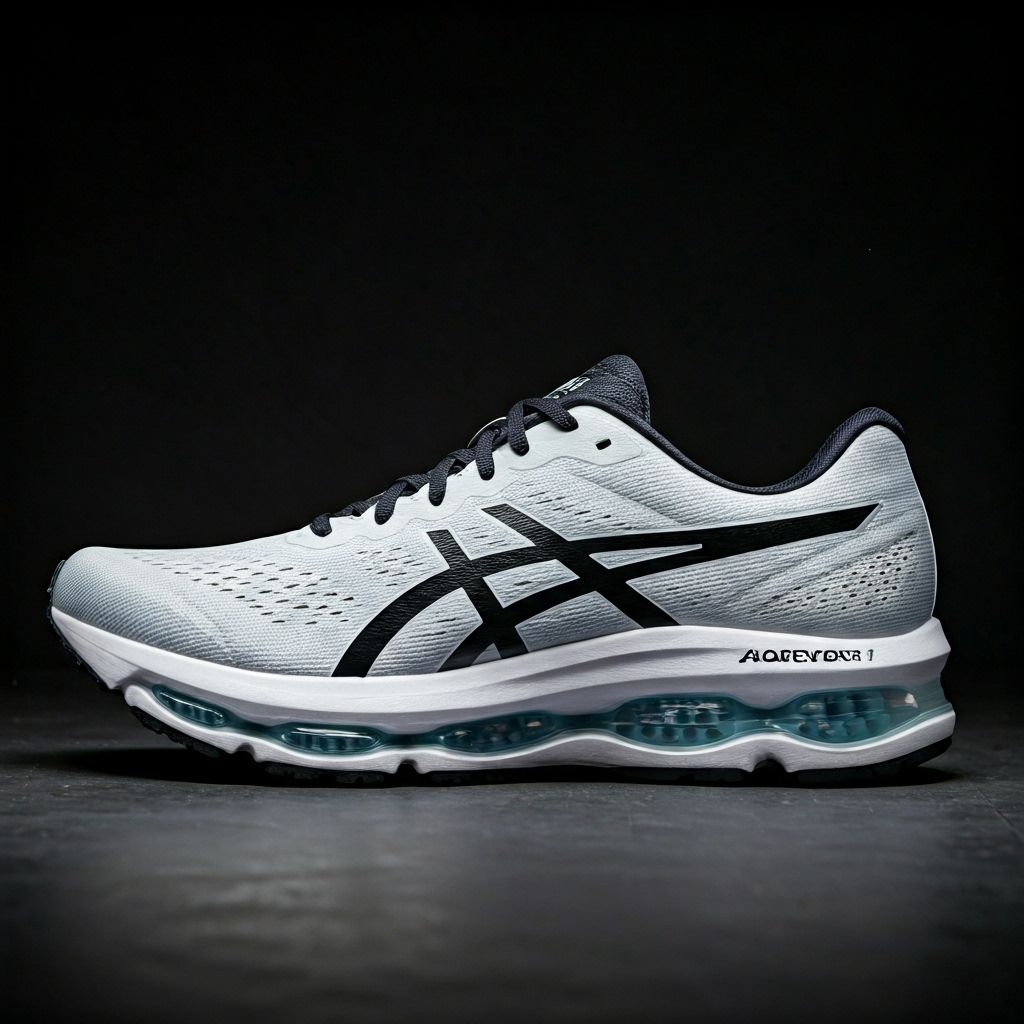
PRODUCT NAME
CATEGORY
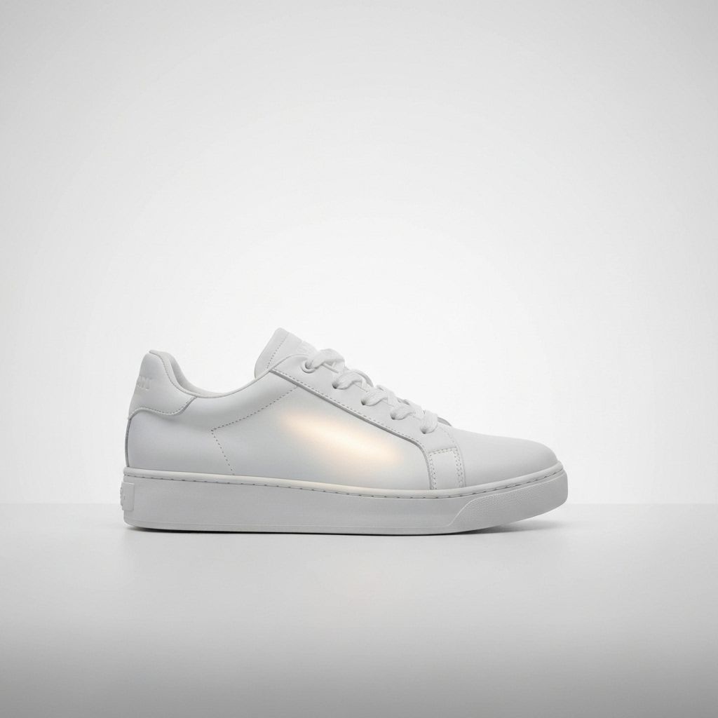
Product Card with Badge
NEW ARRIVAL
LIMITED EDITION
$349Image Overlays
Gradient Overlays
Gradient: Top → Bottom
Dark at the top, softer mid, fades to clear
Gradient: Left → Right
Light on the left, medium center, darkest on the right
Gradient: Bottom → Top
Strong at the bottom, mid-strength center, fades to clear
Hover Overlays
Subtle Hover (20% opacity)
Reverse Hover (fade out)
Backdrop Blur (Background Blurred)
Blurred Background
Image uses blur effect
Badges & Labels
Status Badges
Category Labels
Collection Labels
FW25 DROP
BEHIND THE SCENES
LIMITED EDITION
Letter Spacing
Letter spacing (tracking) is used extensively for uppercase text to create a refined, editorial feel.
TIGHT TRACKING
0.02em - Headings and titles
NORMAL TRACKING
0.1em - Standard uppercase text
MEDIUM TRACKING
0.15em - Buttons and CTAs
WIDE TRACKING
0.2em - Section labels
EXTRA WIDE TRACKING
0.3em - Special emphasis
Image Grid Layouts
Asymmetric Grid (2:1 Ratio)
Symmetric Grid (Equal Columns)
Masonry-Style Grid
Design Principles
Editorial Sophistication
Clean layouts with generous whitespace, inspired by high-end fashion magazines and editorial design.
Minimal Aesthetic
Subtle borders, minimal radius, and restrained use of color create a refined, luxury feel.
Typography First
Strong typographic hierarchy with carefully selected fonts creates clear visual structure.
Purposeful Motion
Smooth, intentional transitions enhance user experience without overwhelming or distracting.